Behind #bbatx: A New Brand for a Growing Organization
In March, the #bossbabesATX team sat down and brainstormed what we want our future to look like, and we realized that part of that meant changing our visual identity. We're a multifaceted team that's part of a multifaceted community. And much as we've liked using plants and the color pink in our branding (how millennial are we—really?), we realized those things don't represent us. As a team and as a community, we're much more, and it was time for a change.
First and foremost, what has changed at #bossbabesATX?
Since we've been in operation, we've developed our mission and strengthened our avenues of impact. Through our productions (like BABES FEST, SHE TALKS and craftHER Market) and coalition-building services (like our meet-ups, Community News platform and digital artist residency), we've provided a platform of visibility and socioeconomic empowerment to 300+ Texas-based women artists, 500+ women-owned businesses and women activists. We've come a long way from one little meet-up in 2015.
Why was a rebrand required to communicate some of these changes?
Over the last two years, #bossbabesATX has grown organically and rapidly. Much of what we have produced and sent out into the world has been reactive and a direct representation of our community's needs in that moment in time. As we approached our 2-year anniversary milestone, in May we decided it was time to reroute our energy into long-term planning and intentional thought/programming. To better mitigate shit-storm politics and gender inequity, we want to cultivate a creative resistance that will carry us through hell and high water. Something that prepares us for the future.
What hasn't changed and what are we taking with us?
As an organization, we exist to bridge differences and explore tough topics. We're also community-minded, and we get weird and awkward. We're dedicated to to cultivating a community that discusses, debates and supports. And although our visual identity won't matter to most and our mission of amplifying and connecting self-identifying women in creative industry and the arts is still our lifeblood, we want to make sure that we're always sending a message we can stand behind.
So, our programming committee (which will soon be open to public application) sat down to scheme up a new look for #bossbabesATX with the following five tenets in mind:
Personal and professional development
Our personal and professional development programming aims to introduce new ideas, prioritize informed decision-making, facilitate employability, enhance our community’s quality of life and contribute to the realization of attendees’ ambitions and aspirations.
Community Infrastructure
To create a society that better supports the financial and social empowerment of women and marginalized people, we must create new physical and organizational structures for the operation of our communities. Our programming works to build coalitions between pre-existing organizations and thought leaders that strengthen paths of accessibility for women artists, entrepreneurs and activists. For this reason, all of our productions involve a number of partners and we facilitate the distribution of community news, job listings and opportunities.
The Arts
We work to promote the visibility and social/financial empowerment of self-identifying women in the arts and various branches of creative activity.
Activism
Our productions center on activism and engagement in the community. We work to promote social, political, economic and environmental reform in the hopes that our efforts may have a positive impact on women’s civil rights, sexism, racism, gender inequity and other issues addressed within intersectional feminism.
Entrepreneurialism
Our workshops, discussions and professional development programming works to make concepts of entrepreneurialism and self-employment more accessible. As a rapidly growing sector of the United States economy, the support and continued growth of women business owners and entrepreneurs is paramount to developing a culture and society more equal for all.
After sitting with these identified tenets, we arrived at a few mood boards:


From there, Jasmine and Rena (both formerly on our committee as creative leads) explored fonts, colors, imagery that represented some of these mood boards. They presented new directions and we deliberated. We discussed what fonts mean. We argued about circles v. blobs. We made the logo big. We made the logo small. We spent a lot of time discussing the message we send, because words, fonts, shapes, images and lines have so much meaning. It's possible to derive social and political cues simply from looking at graphics alone. So, through conversation and months of internal design, we've inched toward a new visual message.
Ultimately, we selected one of Rena's directions (Rena also designed the visual identity for BABES FEST this year) and have slowly refined that direction into the brand you're viewing today. Although our visual identity will continue to morph and change as we grow, we're happy to debut this new brand today across our online channels!
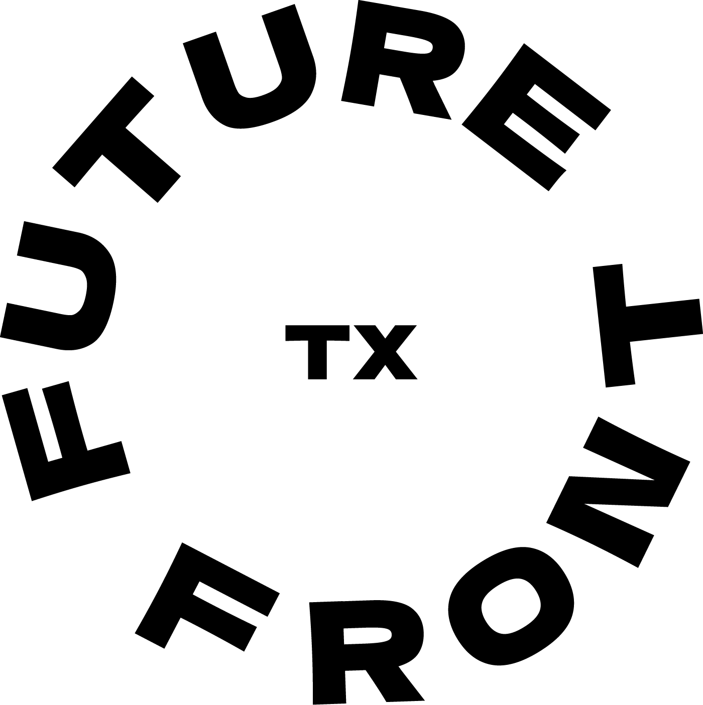
You can take a peek at our logo, color scheme and font selections below:


Here's a few quotes from the team on what this new brand means to us:
If our brand was personified as a human being, I like to think the process of rebranding is her metaphorical puberty, coming of age, or "glow-up" if you will. She's always been the same compassionate, open-minded whacky girl. But as she journeys through the highs and lows of life, observing and participating, misunderstanding (at first) and then understanding the people and community of her hometown and world, she gains a little clarity of who she is, what she gives a damn (or a lot of damns) about and discovers what she's good at. #bbatx gives a whole lot of damns about community among self-identifying women who create art, businesses and themselves. Luckily, we're pretty darn good at bringing them together. Now we know, and now we can say that with certainty while donning a spicy new outfit. - Rena Li, designer
Hopefully, the new brand represents a slice of each #bossbabesATX team member and a slice of everyone that comes through our events. We're the weird folks, who sit at the intersection, who aren't scared to be wrong or to stand up for what we think is right. We think you can be interested in entrepreneurialism, personal and professional development, activism, feminism and the arts all at once. We think equality and diversity of opinion are inherently valuable. We celebrate femme; we celebrate masculinity (the good kind). We think it's OK to explore, learn and mess up. We think being a woman means something different for everyone. We don't think anatomy has anything to do with that. We think being a business owner means something different for everyone. We don't think capital has anything to do with that. We're just here to learn... So, yeah, maybe that's what the new brand represents—mature, fun-loving, bra-burning perpetual students. - Jane Hervey, founder and Executive Director
The new branding represents the future, intersectionality, warmth, Tejanx cultura and inclusivity. When we were in the beginning stages of rebranding, the image that kept popping up in my head was a disco diva in the desert. A self-identifying woman who looks and feels of the future, who is the future, battling things that come her way with strength, style, and grace. - Leslie Lozano
[The new brand represents] intersections of real images and colorful/semi whimsical illustrations with earth tones speaks to us—free, fun, natural, inclusive but very serious and intentional. - Maureen Nicol
#bossbabesATX is a revolution. [We're] influencing and challenging a culture of how we view and treat women artists, business owners, and the conventional ideas of femininity. This rebrand is in sync with that quality—from the warm and cool Texas color tones to the underlining of ATX following BB in the logo. It allows for bossbabes to expand to neighboring cities, states, or countries! (i.e. Houston, Texas would be #bbHTX; McAllen, Texas would be #bbMTX, etc.). - Illyana Bocanegra
Texas pride is real, y'all. When I think about Texas, I get ferocious about defending it. I am proud of my fight for this state and its future. I am proud of the people who live here and stand rooted despite all the whack shit that transpires at the Capitol. Our rebrand represented a series of conscious decisions for us. We wanted to ask ourselves what our community looks like, and how do we want to be a part of it. How do we represent the collective strength, both quiet and loud, of all these powerful women? - June Chee
*It's important for us to note that this rebrand was accomplished on donated, volunteered time from both our committee and the designer, Rena Li. We are grateful for their contributions and commitment to improving our organization. Got questions about the rebrand? Curious about our programming and org? Shoot us an email: thebabes@bossbabes.org.